
Ecommerce Design
Jordan’s Furniture
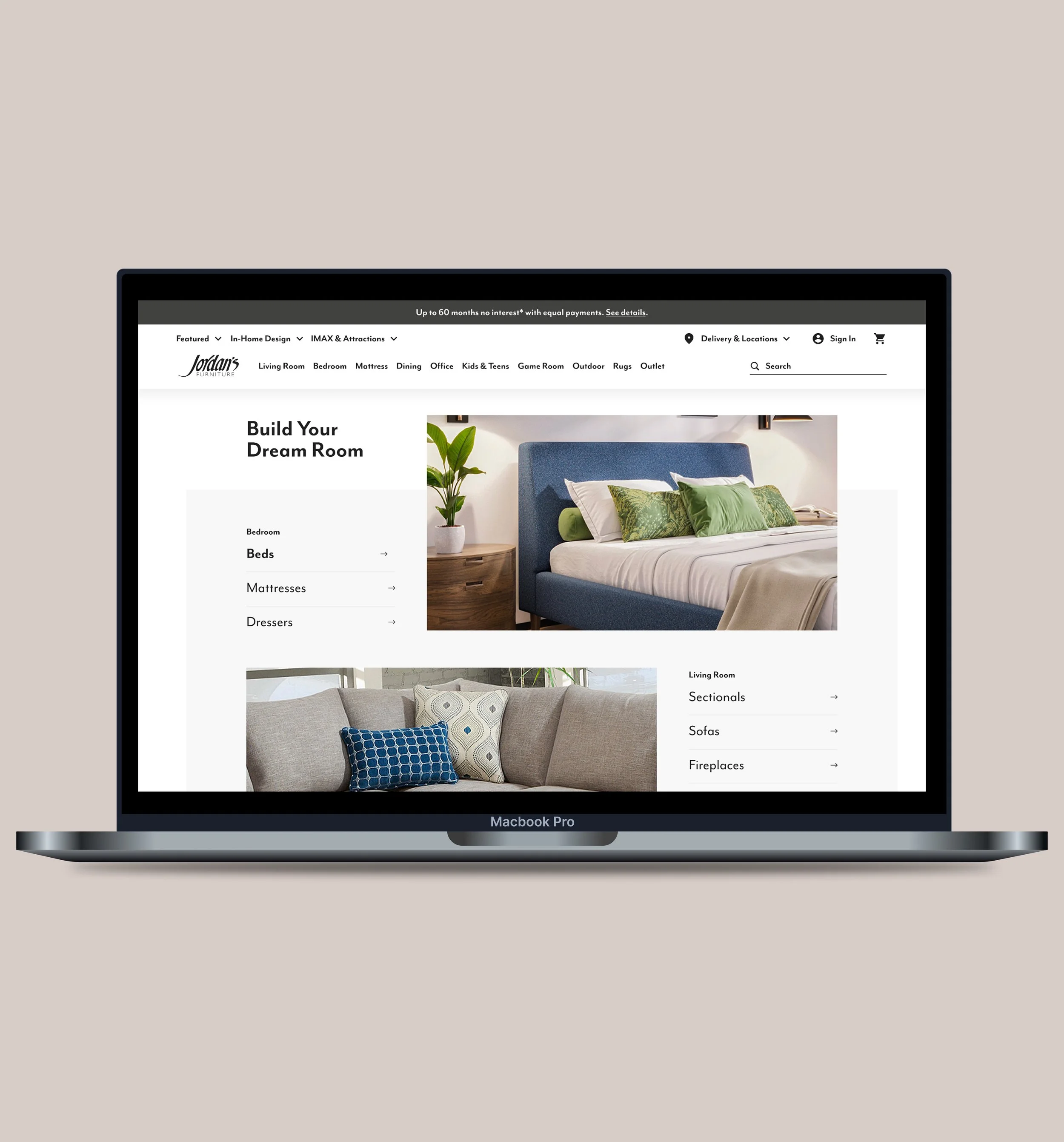
A data-informed landing page redesign to re-engage returning shoppers.
Problems and Goals
The Problem
Returning users relied heavily on search and often abandoned the page, signaling that the landing experience wasn’t meeting their needs.
The Goal
Design a more useful landing page that guides discovery directly on the page; reducing reliance on search and re-engaging users.
Before and After
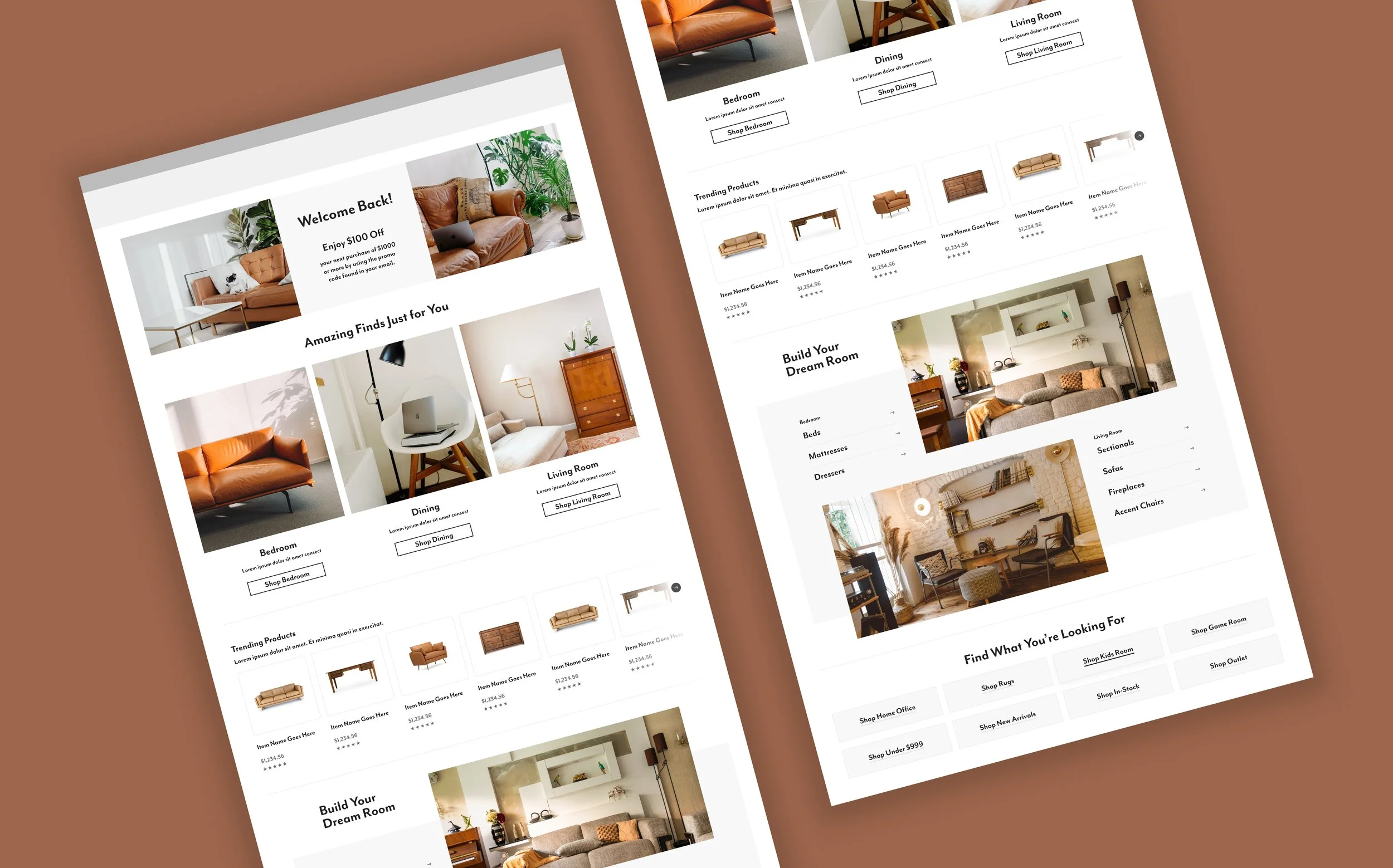
Before the data analysis (left) and after the full redesign (right).
When users rely on search instead of the page itself, it’s a sign the UX isn’t meeting their needs.
Research Approach
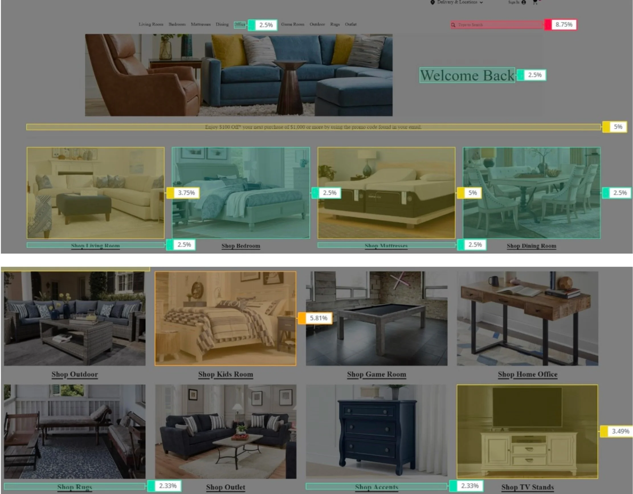
I partnered with a data analyst to review eight months of Google Analytics and Glassbox data, examining how returning users navigated the page and responded to its $100-off-$1,000+ offer.
Key Findings
Heavy reliance on search
Users frequently bypassed page content to find products.
Early user abandonment
Users frequently bypassed page content to find products.
Uneven engagement
Promotional messaging and some lower-page content attracted interaction, while category engagement varied.
Key Insights Leading to the Final Product
Create a Personalized Experience
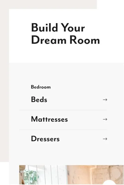
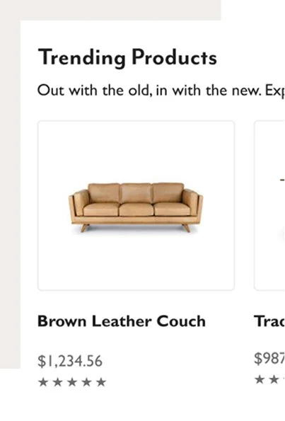
The redesign offers returning users curated choices informed by their behavior, highlighting lower-priced products and reducing clutter to make shopping more relevant and approachable.
Blending Storytelling with UX Best Practices
The redesigned layout pairs inspiration with actionable product discovery, using clear hierarchy, budget-conscious options, and a prominent promo offer to re-engage returning users and make shopping more intuitive.