
The State of New Hampshire
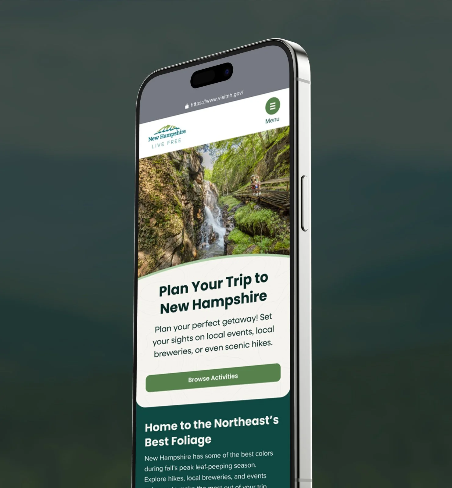
Brand-forward tourism website redesign with refreshed visuals and clearer navigation for in and out-of-staters.

Kentico Site of the Year 2024
W3 Davey Awards 2025
Problems and Goals
1 | Problem One
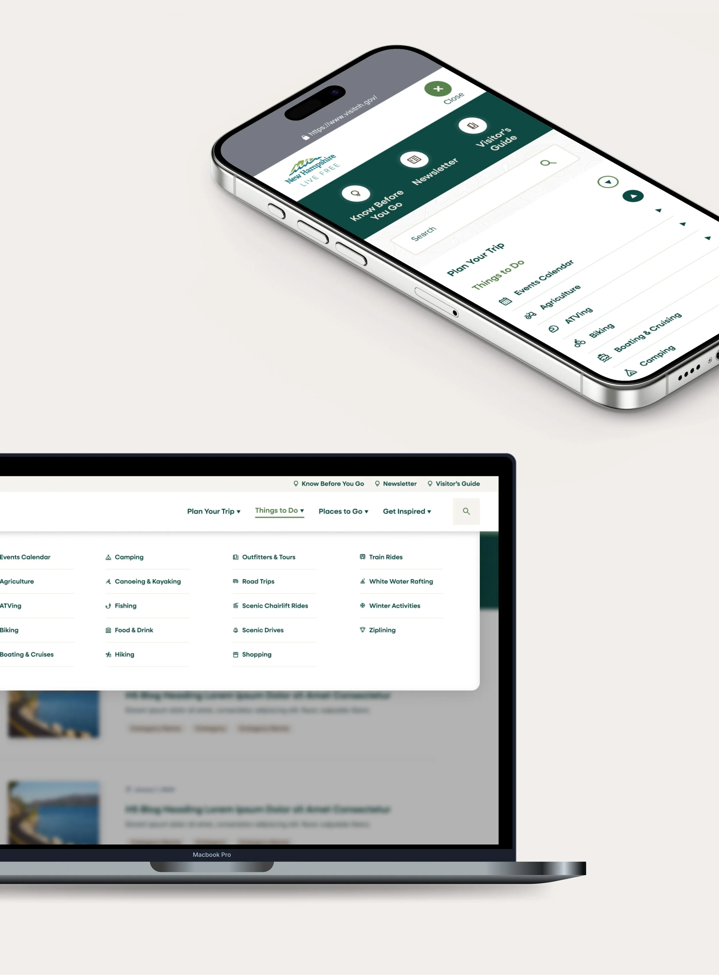
Scattered and confusing navigation made it hard for users to navigate the site and discover New Hampshire happenings.
1 | Goal One
Simplify discoverability of activities and events by making the navigation and search more useful.
2 | Problem Two
The mixture of large text blocks, lack of iconography, and oversized imagery made the content feel overwhelming and hard to digest.
2 | Goal Two
Modernize the visual language by adding visual cues, shortening text copy, and strategically placing images.
3 | Problem Three
An outdated and unorganized interface caused a lack of engagement in key areas like the calendar, bookings, and events.
3 | Goal Three
Develop a design system that uses a clear and structured button and UI system in order to increase engagement.
The Process
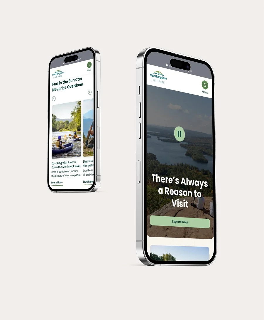
Modernized design system with updated color, typography, and components to unify brand across seasons.
Collaborated with strategists to refine navigation, hierarchy, and page structure for more engagement.
Working with a Digital Strategist, we utilized GA4 to gather insights into what was underutilized on the site. We used Miro to collaborate and develop a sitemap. I used Figma to design the wireframes and designs.
Applied the system across key templates, balancing storytelling with scannable, task-focused layouts.
+30%
Engagement
+20%
Calendar Visits
+30%
Engagement